Key ideas for curating your indoor space
I recently wrote about how lucky I feel to be able to express myself through my living space. Our homes are like our minds laid out before us, and it can be immensely satisfying to curate a space that feels like a true reflection of our personalities.
Having recently moved to Melbourne, Australia, from Oxford in the UK, I was confronted with the need to entirely furnish a new home in a short space of time. With the clock running down on my AirBnB, I needed to move fast. This really helped me to distill what matters to me in a home, and what I felt was ‘essential’ versus things that were just decorative flourishes. Predictably I ended up relying quite heavily on IKEA, which I hadn’t been to for years. It was fun shopping around, but I’m also looking forward to complementing my new schemes with some items from back home when my shipping finally arrives. I thought I’d share with you some of the different ideas and elements I thought of to inspire me as I went about setting up home in a new country.
Colour and Print

Colour will almost certainly be the first thing you notice on entering a room. Whether it’s a statement wall or calming neutrals, colour can easily dominate your appreciation (or not) of a space. Sadly many of us, myself included, are unable to experiment with colour on our walls, as we live in rented accommodation. So from my perspective colour is about finding ways of introducing interest within these rigid parameters. Thankfully there are plenty of ways to brighten up a space and add visual appeal without breaking your tenancy agreement. Unsurprisingly the simplest way of doing this is with your soft furnishings. I am an unashamed cushion fiend – I think I would fill every room in the house if I could. Thankfully I manage to restrain myself, but there is a lot of pleasure to be found in a carefully chosen cushion. They introduce big patches of bold colour into a space and can carry a beautifully complementary palette. Try not to stick to just different hues of the same colour. Use complementary colours to create greater visual interest, and a more complete composition.
If you’re feeling bolder you can use large-scale artworks to add colour to a space. There are lots of large, abstract prints available online, and if you go big, you can even find pieces larges enough to lean if you aren’t allowed to use picture hooks. There is a rather blank and bland wall in my bedroom I have plans for fixing with this. You don’t just have to go abstract either; a print of one of your favourite paintings can add a great deal of character. Lots of 19th and 20th century artists feared being seen as decorative, but some, such as Matisse, embraced the comforting visual appeal pf their works. So you needn’t worry too much if you choose a piece partly because it matches your colour scheme!
In a similar way to a carefully placed artwork, a bold print can help to lead the eye through a space. Hints and patches of print will draw you into the room, and can create zones and corners. Unless you’re really going for it you’re best to avoid clashing prints, but try not to stick to the same print repeated over and over throughout the room. Choose contrasting patterns in similar or complementary colours to add character and stop your space from looking too ‘matchy-matchy’. The absolute queen of colour and clashing prints is interior designer Sophie Robinson. I think she has succeeded in creating my dream kitchen! Check out her Instagram to see some of her truly fabulous schemes, and pick up some helpful hints and tips.
Texture and Material
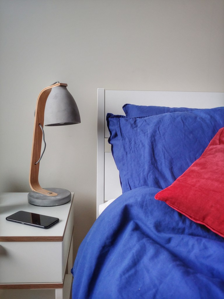
Key to an interior are the textures and materials you choose to fill it with. These can be as important as the colours. You’ll be pulled in by that first hit of colour, but it’ll be the textures and materials that make you want to stay. Highlighting different textures can give a room a totally different feel – from rich velvets to subtle silks and dominant concrete. As much as the colour, it will be the materials you choose that set the mood of your room.
In any space you should try to aim for a balance of textures and materials. If you use one material too much it can start to feel a little overbearing or ‘themey’. Just think of those living rooms with entirely leather furniture – not a look you want to replicate. Picking materials with varied textures can give a room a greater sense of depth – by using tactile materials you are moving beyond simple visual appeal and creating an engaging environment. Add texture with thickly woven fabrics or deep soft furnishings, and balance these with smoother and harder elements. For instance, I balance the deep, soft, snuggliness of my bed with the toughness of a concrete lamp. You don’t always have to go for industrial elements and strong contrasts (copper piping is quickly reaching the point of being over-done), just try to build variety into your planning. Look around for materials that appeal to you – if you find yourself wanting to touch it, it’s probably the one for you!
Natural vs. Human-made

This is another question of balance. Natural materials are almost always superior to human-made ones. On the one hand, they are (usually) better for the environment, and often out-perform their human-made equivalents. For instance, wool is naturally fire-retardant, and will burn at a far slower rate than materials like polyester. So they can make your home safer as well as more pleasant to be in. Their fire-resistant qualities aside, natural materials can bring a degree of warmth and character to your scheme.
But on the other hand, natural materials are often prohibitively expensive. Not all of us can afford to go down the all-natural route, and when we do buy items they often end up being heirloom pieces, not enough to furnish an entire room. So a carefully chosen human-made material can be a good substitute. There are also aesthetic qualities which natural materials cannot reproduce. The rough, industrial qualities of concrete or the strangely pleasing texture of Bakelite cannot be found in the natural world. It is simply a matter of ensuring that there is a balance in your home, that neither element dominates, but rather they sit alongside one another harmoniously. The concrete lamp is another good example of this: it uses natural materials in a modern way to complement an assertively human-made material, with a pleasingly sculptural result.
So try to aim for an even mix, and pick items that encourage harmony rather than over-reliance on a particular mode of production.
What key principles do you consider when growing your interior designs? Are there any designers whose work particularly inspires you? Please do share your thoughts, tips and ideas in the comments below!

[…] to see that Princess Highway’s gorgeous prints weren’t limited to clothes. I’ve written before about how important prints can be for bringing character to a room, so I was so pleased to find this charming cushion. The print is lively and vibrant, and just what […]
LikeLike